Custom Styling of User Interfaces via CSS
Description
This documentation provides guidance on how to utilize custom classes for the chat , chat widget, navigator, and search user interfaces.
- Web Components: Our user interfaces are designed as web components. Web components are a suite of different technologies that allow you to create reusable custom elements — with their functionality encapsulated away from the rest of your code — and utilize them in your web apps. For further details, refer to the MDN documentation on Web Components.
- Style Inheritance: These user interfaces are capable of inheriting certain style elements from the page they are embedded in, such as
font-sizeandfont-family. This is intentionally done to ensure the user interface integrates seamlessly with the host page's design. We use style inheritance only for fields that display your own content. Styles (with the exception offont-family) are not inherited for branchly-defined components. - Customization with CSS: To tailor the look of our user interfaces according to your preferences, you can apply custom CSS styles to the pre-defined container listed below for each separate User Interface.
- Applying Custom Styles: You can insert your custom styles within a
<style>tag directly in your HTML document or include them in an external.cssfile. When defining your styles, you may need to use the!importantdeclaration to override the default styling. For example,font-size: 0.7rem !important;ensures that your size specification will take precedence over the existing style.
By following these instructions, you can effectively customize the appearance of the chat , chat widget, navigator, and search to match the aesthetic of your website or application.
Text color for white-background elements
Some elements (suggested-question bubbles, reset buttons) have a fixed white background. Their text color automatically adapts for readability: if your configured font_color is too light against white, a readable fallback color is used instead. This ensures text is always visible regardless of your font_color choice. To override this behavior, target the element's class (e.g., .suggested-question { color: your-color !important; }).
Specify styles when embedding
You can customize and specify styles already when embedding the Container on your website. More about this option here.
Chat (chat embed)
#branchly-chat-embed-container {
}

.embed-title {
  /* alias: .welcome-heading */
}

.welcome-heading {
  /* alias: .embed-title */
}

.welcome-heading-container {
}

.home-button {
  /* alias: .reset-button */
}

.reset-button {
  /* alias: .home-button */
}

.next-nodes-container {
}

.next-node {
}

.assistant-name {
}

.assistant-message {
}

.user-name {
}

.user-message {
}

.chat-container {
}

.chat-button {
}

.chat-input {
}

.chat-input::-webkit-input-placeholder {
  /* WebKit browsers */
}

.chat-input:-moz-placeholder {
  /* Mozilla Firefox 4 to 18 */
}

.chat-input::-moz-placeholder {
  /* Mozilla Firefox 19+ */
}

.chat-input:-ms-input-placeholder {
  /* Internet Explorer 10 */
}

.suggested-questions-container {
}

.suggested-question {
}

.carousel-button-left {
}

.carousel-button-right {
}
Chat Widget (Chat Widget)
#branchly-chat-widget-container {
}

.chat-widget-container {
}

.widget-header-container {
}

.widget-interaction-container {
}

.close-widget-button {
}

.welcome-message {
  /* alias: .welcome-heading */
}

.welcome-heading {
  /* alias: .welcome-message */
}

.widget-welcome-message-container {
  /* alias: .welcome-heading-container */
}

.welcome-heading-container {
  /* alias: .widget-welcome-message-container */
}

.chat-bubble-container {
}

.next-nodes-container {
}

.next-node {
}

.assistant-name {
}

.assistant-message {
}

.user-name {
}

.user-message {
}

.chat-container {
}

.chat-button {
}

.chat-input {
}

.chat-input::-webkit-input-placeholder {
  /* WebKit browsers */
}

.chat-input:-moz-placeholder {
  /* Mozilla Firefox 4 to 18 */
}

.chat-input::-moz-placeholder {
  /* Mozilla Firefox 19+ */
}

.chat-input:-ms-input-placeholder {
  /* Internet Explorer 10 */
}

.chat-entry-suggestions-container {
}

.suggested-question {
}

.close-suggested-questions-container-button {
}

.reset-button {
}

.carousel-button-left {
}

.carousel-button-right {
}
Navigator (Embed)
#branchly-embed-container {
}

.embed-title {
  /* alias: .welcome-heading */
}

.welcome-heading {
  /* alias: .embed-title */
}

.welcome-heading-container {
}

.next-nodes-container {
}

.next-node {
}

.search-container {
}

.search-button {
}

.home-button {
}

.content-container {
}

.selected-node {
}

.selected-nodes-container {
}

.search-input {
}

.search-input::-webkit-input-placeholder {
  /* WebKit browsers */
}

.search-input:-moz-placeholder {
  /* Mozilla Firefox 4 to 18 */
}

.search-input::-moz-placeholder {
  /* Mozilla Firefox 19+ */
}

.search-input:-ms-input-placeholder {
  /* Internet Explorer 10 */
}
Search (Search Interface)
#branchly-search-interface-container {
}

.search-app-container {
}

.search-entry-point {
}

.branchly-heading-bubble {
}

.branchly-search-bubble {
}

.heading-message-container {
  /* alias: .welcome-heading-container */
}

.welcome-heading-container {
  /* alias: .heading-message-container */
}

.searchbar-container {
}

.searchbar {
}

.searchbar-form {
}

.searchbar-submit-button {
}

.reset-search-button {
  /* alias: .reset-button */
}

.reset-button {
  /* alias: .reset-search-button */
}

.ai-message-container {
}

.ai-message {
}

.search-results-container {
}

.search-result-card {
}

.search-result-card-image {
}

.search-result-card-content {
}

.search-result-card-accordion-content {
}

.suggested-questions-container {
}

.suggested-questions {
}

.suggested-question {
}

.welcome-heading {
}
Search Interface - Custom Style Cases:
Styling the entry point button:
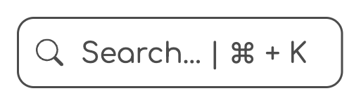
Initially, the entry point button (enabled using the attribute data-view-mode="search-button") displays a search icon alongside the text "Search... | ⌘ + K" or "Search... | Ctrl + K". This second part of the text indicates the keyboard shortcut to open the interface, depending on whether you are using macOS or Windows.
If you wish to render only the search icon without the accompanying text, you can achieve this using CSS with the following rules:
.search-entry-point {
    border: none; /* Removes border */
    padding: 10px; /* Adjusts padding, set your individual value here */
    svg {
      margin: 0; /* Removes default icon margin */
    }
  }

  .search-entry-point span {
    display: none; /* Removes the element with text */
  }
This will result in the following appearance:

Of course, you can adjust different styles for various devices. To achieve this, utilize the @media query option like the following example:
/* showing only the search icon for smaller devices */

@media (max-width: 768px) { /* Set your own breakpoint here  */
  .search-entry-point {
    border: none; /* Removes border */
    padding: 10px; /* Adjusts padding, set your individual value here */
    svg {
      margin: 0;
      font-size: 30px; /* Adjusts the icon size, set your individual value here */
    }
  }

  .search-entry-point span {
    display: none; /* Removes the element with text */
  }
}